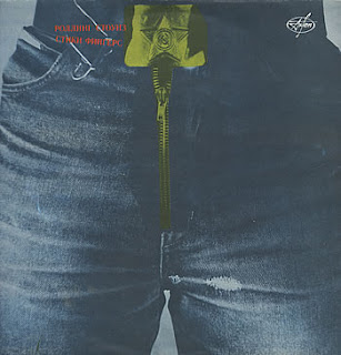
I’ve always admired Andy Warhol’s album cover for the Rolling Stones’ Sticky Fingers and the self-titled The Velvet Underground and Nico. These were the first and earliest examples I had ever seen of album covers that you can actually interact with. The basic function of both is the similar: pulling down a zip on a man’s jeans to reveal his cotton briefs and peeling off a banana skin to reveal and phallic looking banana.
 I also find it interesting and not surprising that the album cover would be objected in certain areas of the world. One such country was Spain and so an alternative cover had to be designed. Also, the 1992 re-release in Russia altered the zipper to feature the Russian iron sickle.
Warhol also worked on other Rolling Stones album covers.


Andy Warhol, particularly during the 1960’s, had a fascination with the consumerism, mass production and everything looking glamorous yet ‘plastic’.
‘I love Los Angeles. I love Hollywood. They’re so beautiful. Everything’s plastic, but I love plastic. I want to be plastic.’
Warhol named his studio The Factory and throughout the 60’s collaboration would become a defining and controversial aspect of his working method. Using the silkscreen, or screen-print method Warhol produced works based on famous American products, big name celebrities and dollar bills.

It was the aesthetic that interested Warhol, what was on the outside and how pretty it could look. Warhol himself appears to be a victim of the aesthetic, something that he would freely admit - he embodied it. Yet he believed that his work should comment and not particularly protest, on this mass generated beautiful and plastic aesthetic.
Warhol saw this mass production and endless repetition as information overload. People were constantly subjected to these images through their television, repeatedly endlessly to the point it just becomes banal and you just accept it.
Warhol’s works displayed a disassociation with art. This was encapsulated in his works 100 Soup Cans, 100 Coke Bottles and 100 Dollar Bills. The same image repeated over and over to the point where all you can see is the dollar bill or coke bottle. There is perhaps something behind all of these soup cans but one cannot see through these soup cans or more cannot see through their labels.


Warhol further emphasised this idea by his use of silkscreen. He didn’t bother to clean away the smudges and imperfections of the print caused by slips of the screen for example. It could pose the question ‘Would these ‘errors’ even be noticed by the viewers? Can they see beyond the aesthetic to spot the imperfections and the lack of skill and quality assurance?

Warhol continued this style for a cover he designed for Rolling Stone magazine’s move to New York City in 1967. This repeated image this time was the New York born lawyer, congresswoman, social activist and leader of the Women’s Movement Bella Abzug.

‘If you want to know all about Andy Warhol, just look at the surface...There's nothing behind it.’
‘The reason I'm painting this way is that I want to be a machine.’
‘I like boring things. I like things to be exactly the same over and over again...Because the more you look at the same thing, the more the meaning goes away, and the better and emptier you feel.’


No comments:
Post a Comment